Common Screen Printing Problems and How to Improve Print Quality
In a cutthroat market, high-quality screen printing is a crucial differentiator for brand identity. From custom apparel to high-volume promotional …
Did you know the font and typeface market is worth $1.09 billion? Fonts are easy to overlook, especially since many of them look similar, but signage fonts are a crucial part of brand identity. They’re an effective way to establish who you are and what you offer.
That said, while some fonts enhance readability and professionalism, others harm your brand’s image and reputation. So, let’s review a few bad fonts for signs to help you pick the right ones for your business.
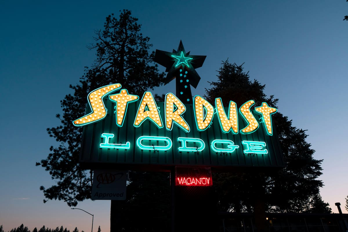
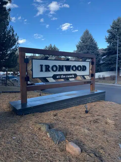
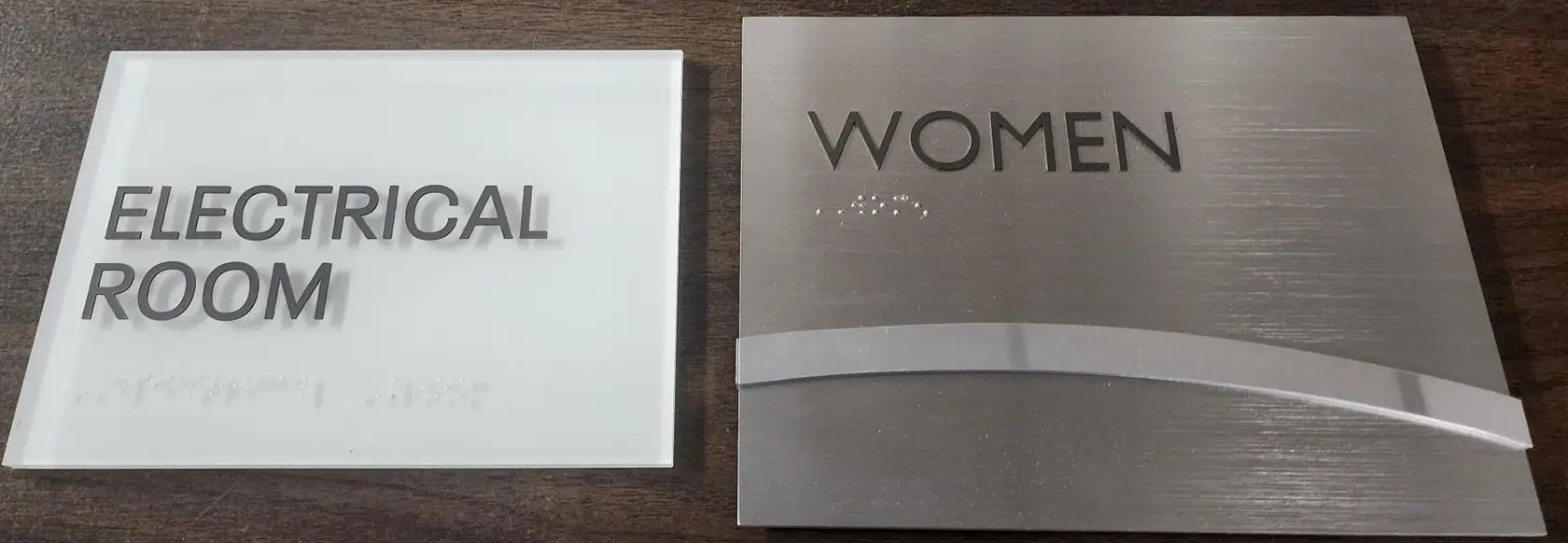
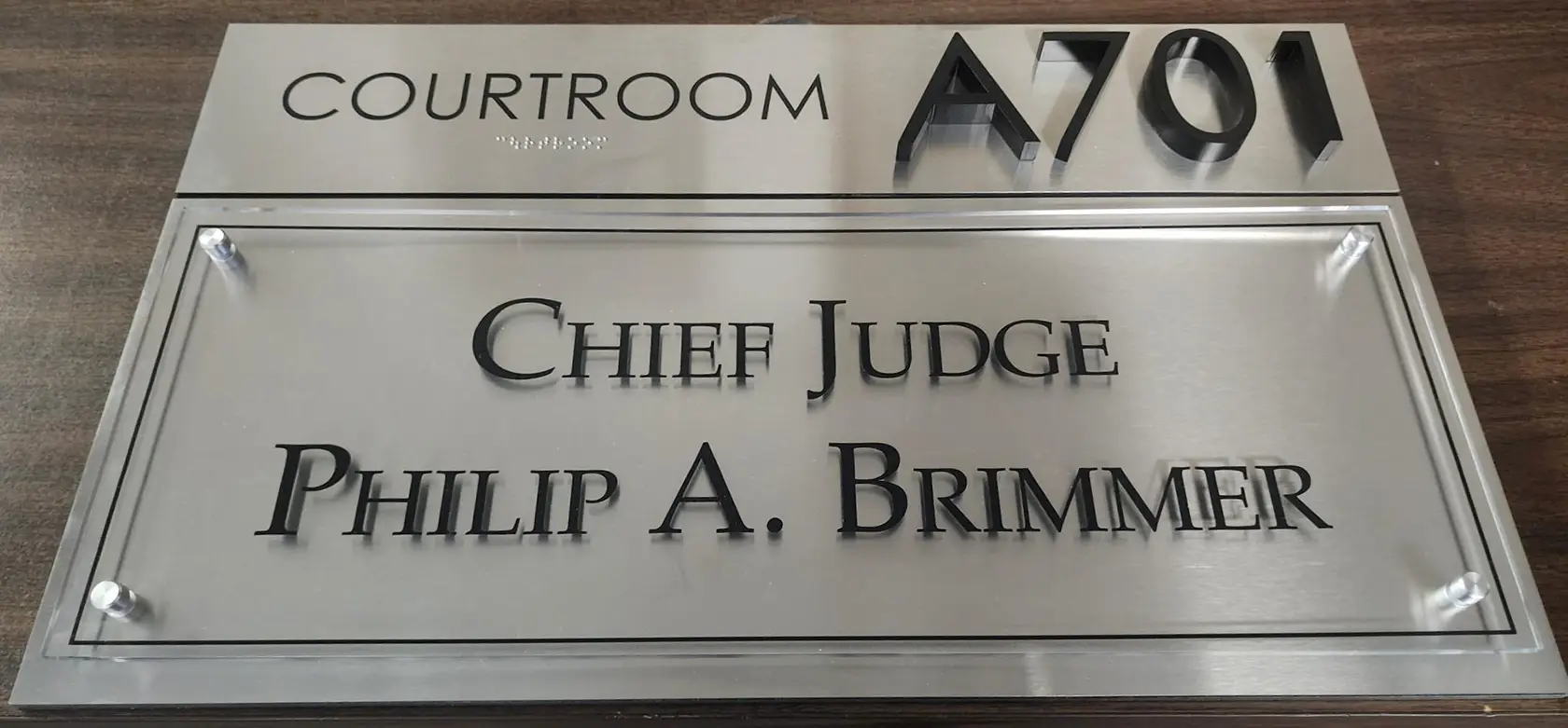
Fonts have a considerable impact on your sign’s effectiveness. First, a readable font is easily understandable. One look at your signage, even from afar, lets potential customers know your brand name.
Matching your sign’s typeface with the rest of your branding materials also builds a more cohesive marketing message across all your touchpoints, making customer interactions more engaging. Ultimately, the right fonts for signs are fundamental to communicating your message to your target audience effectively.
Let’s say you own a high-end Nordic furniture store. You might fancy using a thin, italicized cursive typeface like Cochocib Script to evoke elegance. However, cursives are virtually illegible, especially from a distance, and are better for other types of business.
In this example, the best choice is a font that is simple yet functional—much like Nordic design. So, instead, try using sans serifs, such as the classic Helvetica from Monotype Imaging.
Now, let’s talk about some bad fonts for signs. Many are classics and are still handy in other instances, but they’re either too bland, illegible, or tacky for signage. As such, it’s best to avoid them.
Everyone loves to hate Comic Sans, so much so that there was a movement to ban it. Its infamy isn’t without reason; besides being overused, it looks unprofessional and can make any business appear less credible. Other unique fonts, like Quirky Spring by Anna Zakharchenko, might be better.
The trend of using Papyrus to spice up bland signage has come and gone. Many have associated it with outdated or generic designs, detracting from your brand’s uniqueness and professionalism. Textured signage fonts are also limited in use; hardly any business matches Papyrus’ desert-like vibe unless you sell Egyptian antiques or garbs.
Many bakeries and party suppliers in the ‘90s used Curlz MT to showcase their company’s playfulness and whimsy. However, unless you’re in those industries, the odds are this typeface will be inappropriate for your signage. It makes it look unserious or amateurish—descriptions you don’t want to be associated with if you want to build credibility.
This typeface is popular among many small businesses. But while stylish, it can be unreadable at a distance and could appear outdated. Consider using modern and legible script fonts instead. For instance, Chonky Brush by Sam Parrett retains the Brush Script’s handmade-like appearance but is significantly more legible and distinct.
Impact has always been a staple on the Internet. Its bold appearance, narrow body, and minimal kerning (the space between each letter) make it eye-catching. However, it’s also due to these reasons many perceive it to be overbearing since it takes up a lot of space, completely overshadowing your message.
It’s best to opt for bold fonts that don’t compromise readability, like Archivo Black from Omnibus Type, which looks striking in all caps.
It looks fun at first glance, which is why many businesses once used Jokerman for their signs. That said, its decorative style sometimes comes across as gimmicky and unprofessional. If you’re a law firm, financial institution, or any organization wanting to be taken seriously, choosing plain yet visually appealing fonts is better.
This font is popular among vintage or medieval-themed businesses, considering it looks like it’s written using a quill or fountain pen. Unfortunately, its minimal kerning and narrow body make reading challenging in small sizes or from a distance.
Other calligraphy typefaces, such as Jim Rimmer’s Alexander Quill, are more legible yet retain Vivaldi’s ornate design.
Kristen ITC gives off a fun, childlike vibe that can be charming for particular contexts, including a daycare, children’s library, or school. On the other hand, it has a good chance of undermining your business’s seriousness. Hence, it isn’t recommended for formal organizations like marketing companies and banks, which are better off with bold and sleek font faces.
As a classic font, Times New Roman is present in almost anything: documents, books, and marketing materials. However, its prevalence makes it boring or too standard for impactful signage. Try using other serif fonts, such as Frank Grießhammer’s Source Serif or Robert Slimbach’s Kepler, that are distinctive yet still have a professional look.
Arial is another overused typeface. It might be a global standard, but many perceive it as unimaginative and lacking character, given how many people, businesses, and documents use it. Other sans serif fonts like Maison Neue from Milieu Grotesque are an excellent alternative. They’re simple yet distinctive enough from Arial to subtly elevate your sign’s attractiveness.
Your choice of signage fonts might seem inconsequential to your brand at first glance. But considering the number of classic yet unoriginal typefaces we’ve discussed, you can’t deny their importance in making your sign stand out among the sea of banners in your area and building a positive brand perception.
Remember, a good font can enhance your business’s image, while the wrong one detracts from it. So, don’t hesitate to consult with design professionals from Artcraft Sign Company. We’ll find the perfect font for your signage to help you communicate with your target audience more effectively.
Contact us to get started on your project!
In a cutthroat market, high-quality screen printing is a crucial differentiator for brand identity. From custom apparel to high-volume promotional …
When consumers are faced with rows of products on the shelf or online, the label is the primary factor in …
Entering a busy event can be visually overwhelming, with a barrage of signs—all different sizes, designs, and colors—competing for attention. …